|
Diesen Artikel vorlesen lassen
Getting your Trinity Audio player ready...
|
Pure black, rich black, strong black, warm black, cool black – some say it’s not even a colour, but there are definitely many shades.
Black is one of the most important colours when it comes to printing, both for text and for the design of graphics. However, there are many distinctions to make; after all, black is not the only black! For example, you need to differentiate between pure and rich or a cool or warm tone. There are also as many decisions to be made when it comes to a design’s applications, since not every shade of black is suitable for every purpose. To shed some light on the dark arts, this article introduces you to some of the peculiarities of this seemingly simple colour. We can show you how to find your perfect black.
Strong, rich blacks
The CMYK colour space that is used for printing is a subtractive colour model. This means the more ink that is applied, the darker the colour tone. Since a mixture of cyan, magenta and yellow does not actually produce black, but a grey/brown colour, the black channel K is added. However, on its own the K channel doesn’t produce a rich black either. A satisfactory result is only achieved by correctly adding all of the colour channels. Attempts to define the exact mix usually result in a discussion that has no end. There are simply too many options and too many different tastes.
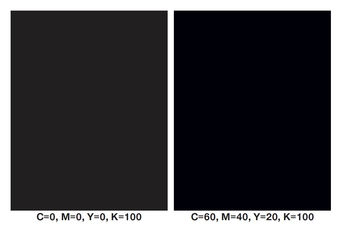
The fact is, however, that pure black, where C=0, M=0, Y=0 and K=100 does not give sufficient depth, coverage or saturation to allow larger elements in particular to stand out with a punchy black. This can only be achieved by adding the other colour channels. And here, both the Internet and technical literature are united in their inability to reach a common agreement. So here are some examples of how to produce an authentic black:
C=60, M=40, Y=40, K=100
C=60, M=50, Y=50, K=100
C=50, M=40, Y=20, K=100
C=40, M=20, Y=20, K=100
At FLYERALARM we recommend a mixture of C=60, M=40, Y=20, K=100. You could also use C=60, M=0, Y=0, K=100 to be on the safe side when it comes to negative elements and to avoid gaps.
If you want a colder, bluer black, simply increase the cyan level, while for a warmer colour increase the magenta and yellow components. The logical solution to the perfect black might appear to be C=100, M=100, Y=100, K=100. However this is not practical, since it means too much ink is applied to the paper. Not only would the paper become completely saturated, it would also take much longer to dry, thus delaying further processing. Therefore, please remember that the maximum ink application for print products is generally 260-300%.
Pure black for text and lines
Blocks of text and slender lines are printed in pure black, which uses just the K channel in a concentration of between 60% and 100%. There are multiple reasons for this: First, a significantly smaller volume of ink needs to be applied for slim letters since otherwise they may appear blurred when printed. In addition, this helps keep both production costs and lead times down. Finally, the softer, pure black is easier on the eye, especially when it comes to long passages of text in books and brochures. When printing larger fonts and heavier lines, for example on large posters, banners or flags, you should use a rich black to ensure the text is still legible from far away.
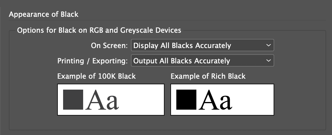
Checking and displaying in your graphic design software
The usual problem of how to obtain a representative preview for the final print product on a screen is magnified when it comes to black. A reliable spot proof is also limited here, since as marginal as the differences appear to be on the monitor, the more obvious they are in print. InDesign does offer some additional help, however: Select the “Display All Blacks Accurately” and “Output All Blacks Accurately” options under Edit > Preferences > Appearance of Black….
Your personal, perfect rich black will help you increase the impact of print products and advertising, especially if the colour is picked out with lamination or varnish. Just like outdoor stickers that are covered in a glossy UV varnish, you can also add a gloss finish to postcards and posters.